Van Heertum Design VHD
The Netherlands
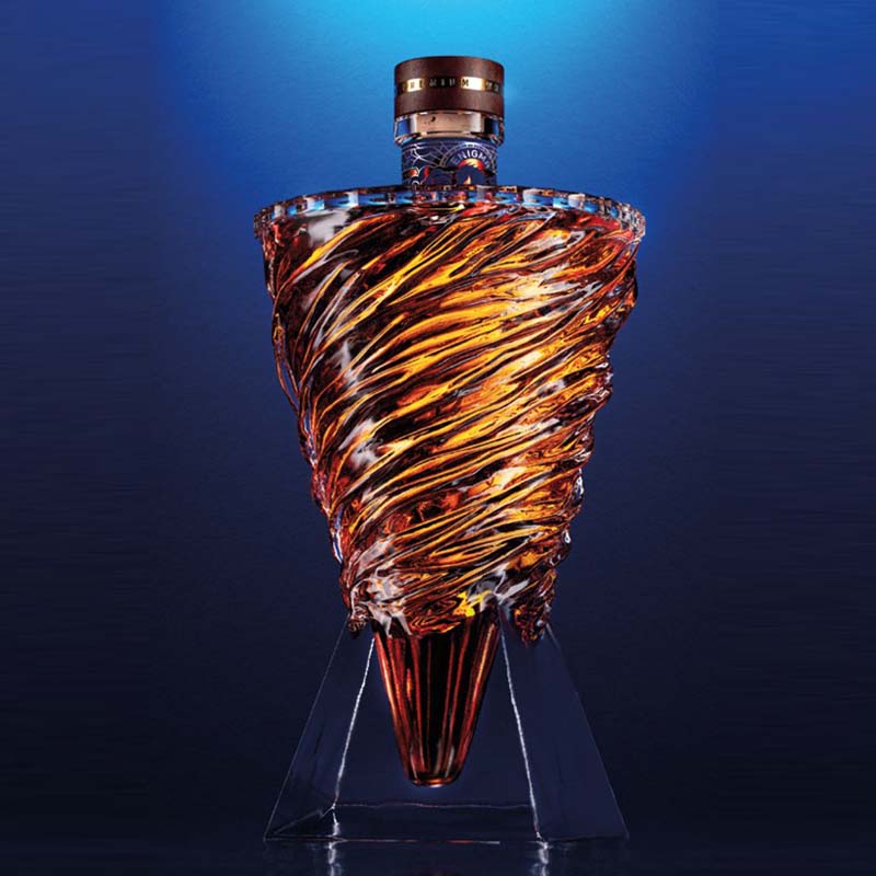
Drawing inspiration from the mystical nature of their original packaging concept “Enigma”, the studio came up with yet another enigma, but one that embodies the fun they had throughout the no-limits creation process of Make a Mark.
Creative freedom and thinking outside the box are possibly the dream of every designer, and this very dream gave birth to the fluffy orange friend of their “X” symbol design.
The orange colour represents the Netherlands, where the studio is based, the soft hair reflects the velvet paper from Avery Dennison used for the original bottle’s label, the golden horn represents the foil from KURZ and the shiny eyes symbolise Estal’s glass vision.
heertum.nl