Rita Rivotti
Portugal
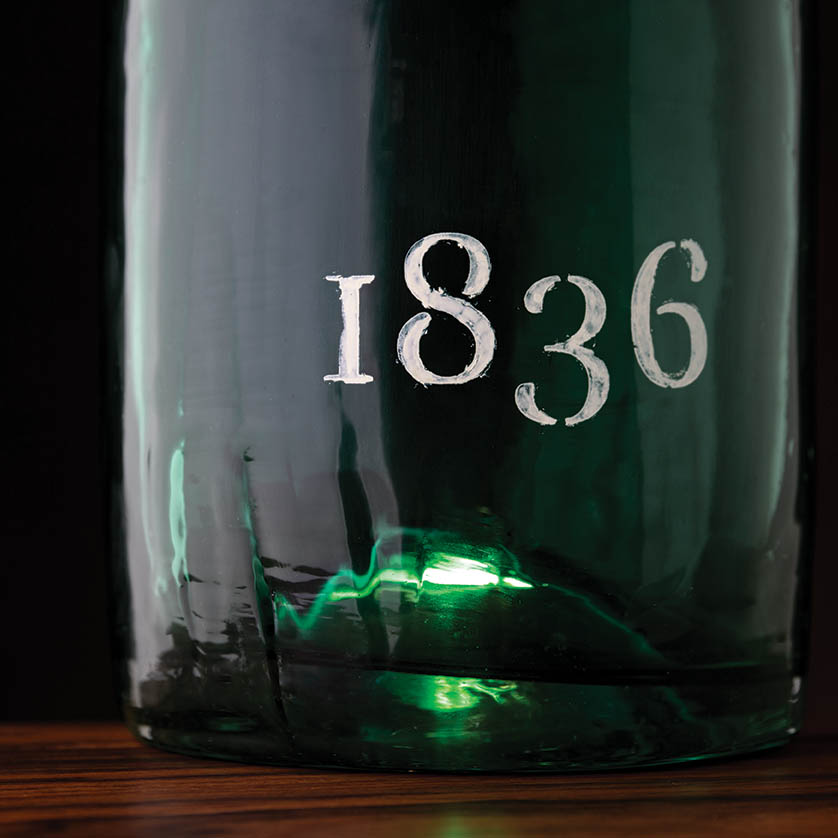
The original packaging design “Port 1836” was created as an ode to the fortified wine typical of the Douro Valley in Portugal, where the studio is based.
In an effort to tell the story of the century-old Port, the “X” symbol design offers an insight into the materials and the craft used in its production: the ancient glass-blowing technique reproduced by Estal is sealed by the same label as the original bottle, made by Avery Dennison to convey the rusticity of handmade paper, and the hot-stamping by KURZ to recreate the old sepia ink.
The whole image is very simple and minimal, leaving room to appreciate the beauty and heritage of these noble materials
ritarivotti.pt