Parallax Design
Australia
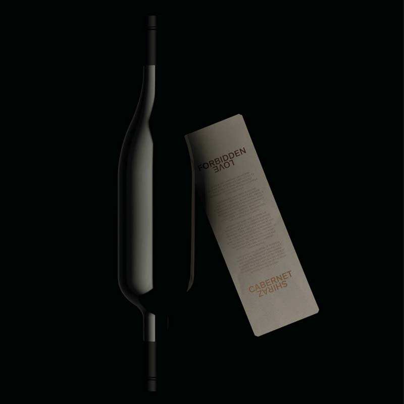
The original wine concept created by the studio for Make a Mark already depicted a shiny “X” on its packaging label.
The new exploration of the “X” mark revolves around this same depiction, that symbolises two grapes, weaving together to create a wine better than the sum of its original parts — Cabernet x Shiraz.
Upon closer inspection, the same symbol also reveals two overlapping hearts: Australia’s gift to the world of wine has become a much loved blend with drinkers and connoisseurs across the globe.
parallaxdesign.com.au