Partisan du Sens
France
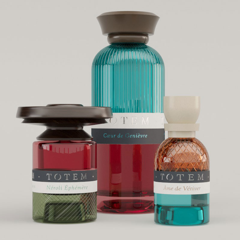
The original “TOTEM” packaging concept is reimagined by the design agency through the lens of the “X” symbol, where colors and textures blend to create a bold and recognisable design.
The label design consistently ties together the various layers, thereby creating visual stability. The hot stamping detail adds a luminous and premium dimension to the letter.
The iconic custom cap of Totem, playing with disproportion, is reinterpreted here to form the connection between the different branches of the “X” symbol.
partisandusens.fr